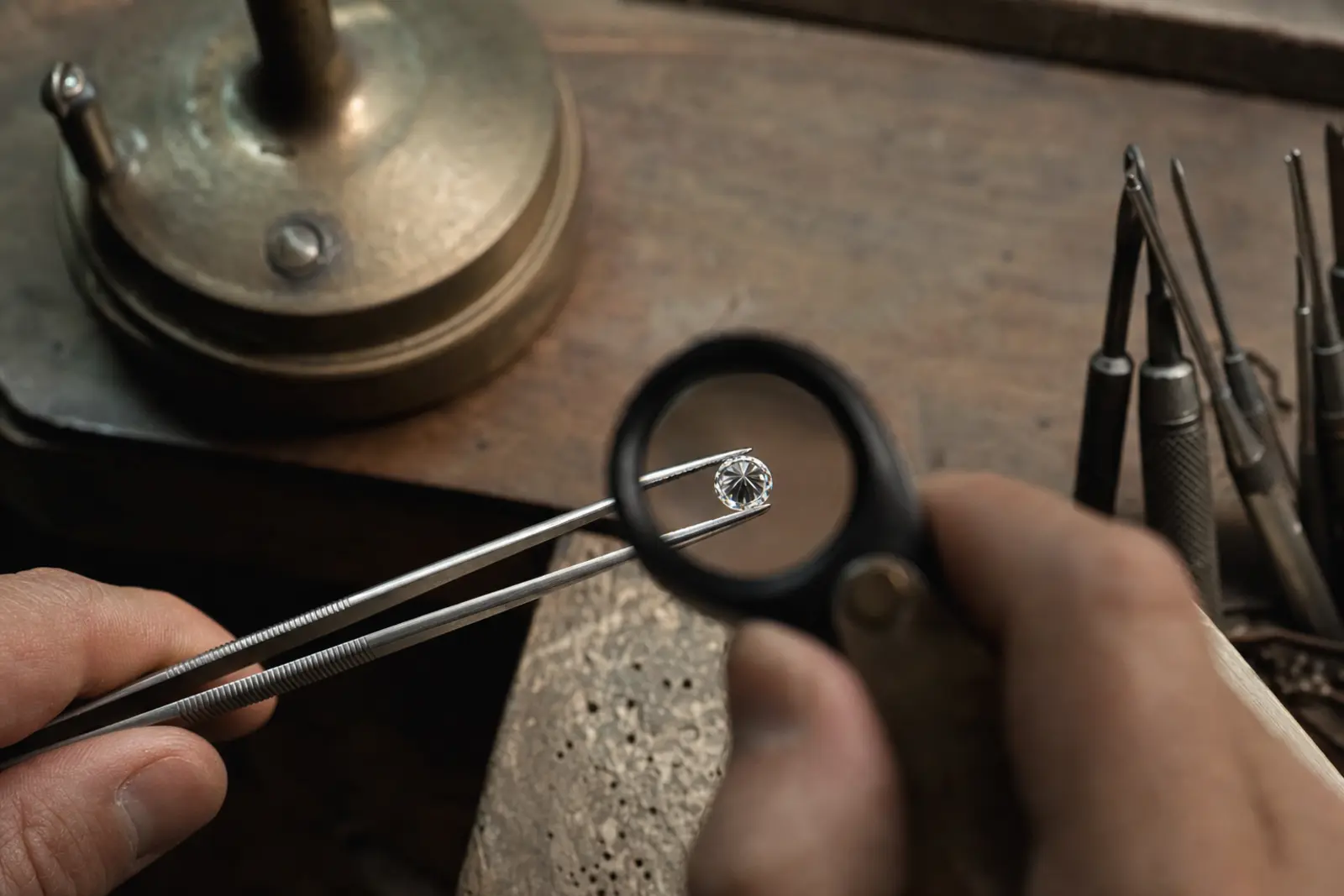
Cut is the only one of the standard grading categories that measures how a diamond was made rather than what it started as, and it is the single factor most responsible for whether a stone looks alive or flat on the hand.
Three effects, not one
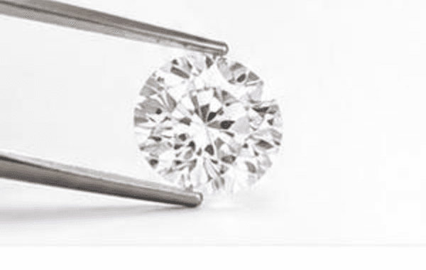
Cut quality is usually described as producing three separate effects, and it helps to know which is which. Brilliance is the white light returning straight back at you, the overall brightness of the stone. Fire is the flashes of spectral colour, reds and blues and greens, that appear as the stone or the light source moves. Scintillation is the pattern of light and dark as the stone catches movement, the sparkle in the strict sense of the word.
A stone can be strong in one of these and weak in another. An overly shallow cut can look bright and flat at once, all brilliance and no scintillation, because it lacks the contrast pattern that makes light seem to move across the surface.
The proportions that decide it
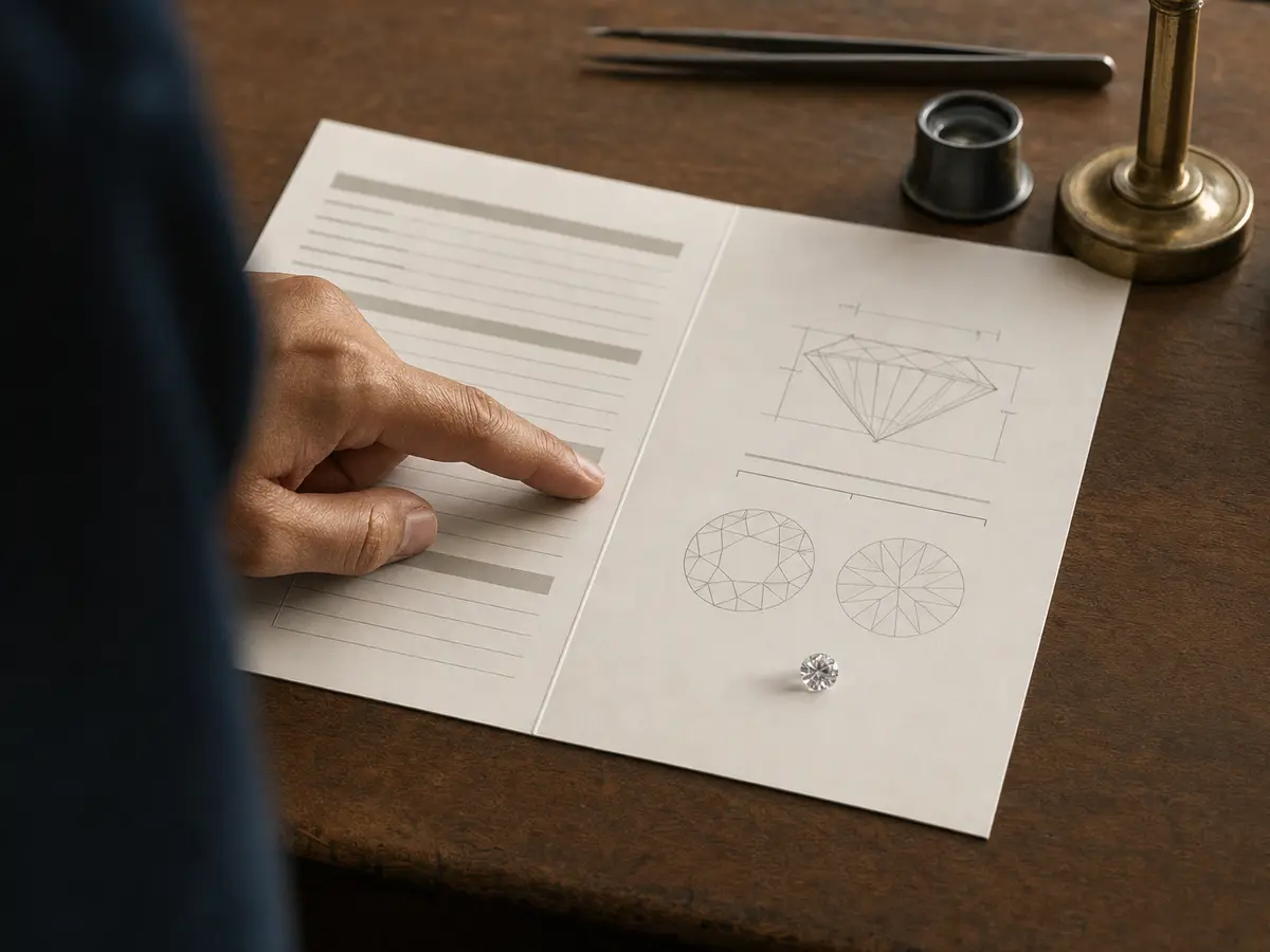
A handful of measurements do most of the work. The crown angle, the slope of the facets above the widest point of the stone, and the pavilion angle, the slope below it, together determine whether light entering the top bounces back out through the top or leaks away through the sides and bottom. The table, the flat top facet, is usually described as a percentage of the stone's width, and a table that is too large lets light pass straight through rather than bending it, which reads as a flat, glassy centre.
Total depth, the stone's height as a percentage of its width, and girdle thickness, how thick the narrow band around the widest point is, both affect the same thing from a different angle: too deep and weight hides in the bottom of the stone where it does nothing for appearance; too thin a girdle chips easily; too thick a girdle adds invisible weight and looks clumsy from the side.
Where light leaks
When the pavilion angle is wrong, light that should reflect back up through the crown escapes instead through the sides or straight through the bottom. Seen face-up, this often shows as a dark ring or a washed-out centre, sometimes called a fisheye or a nailhead depending on which way the proportions are wrong. No amount of polish or symmetry fixes a proportioning fault of this kind. It is built into the stone's angles and it is there in every light.
Why fancy shapes have no cut grade
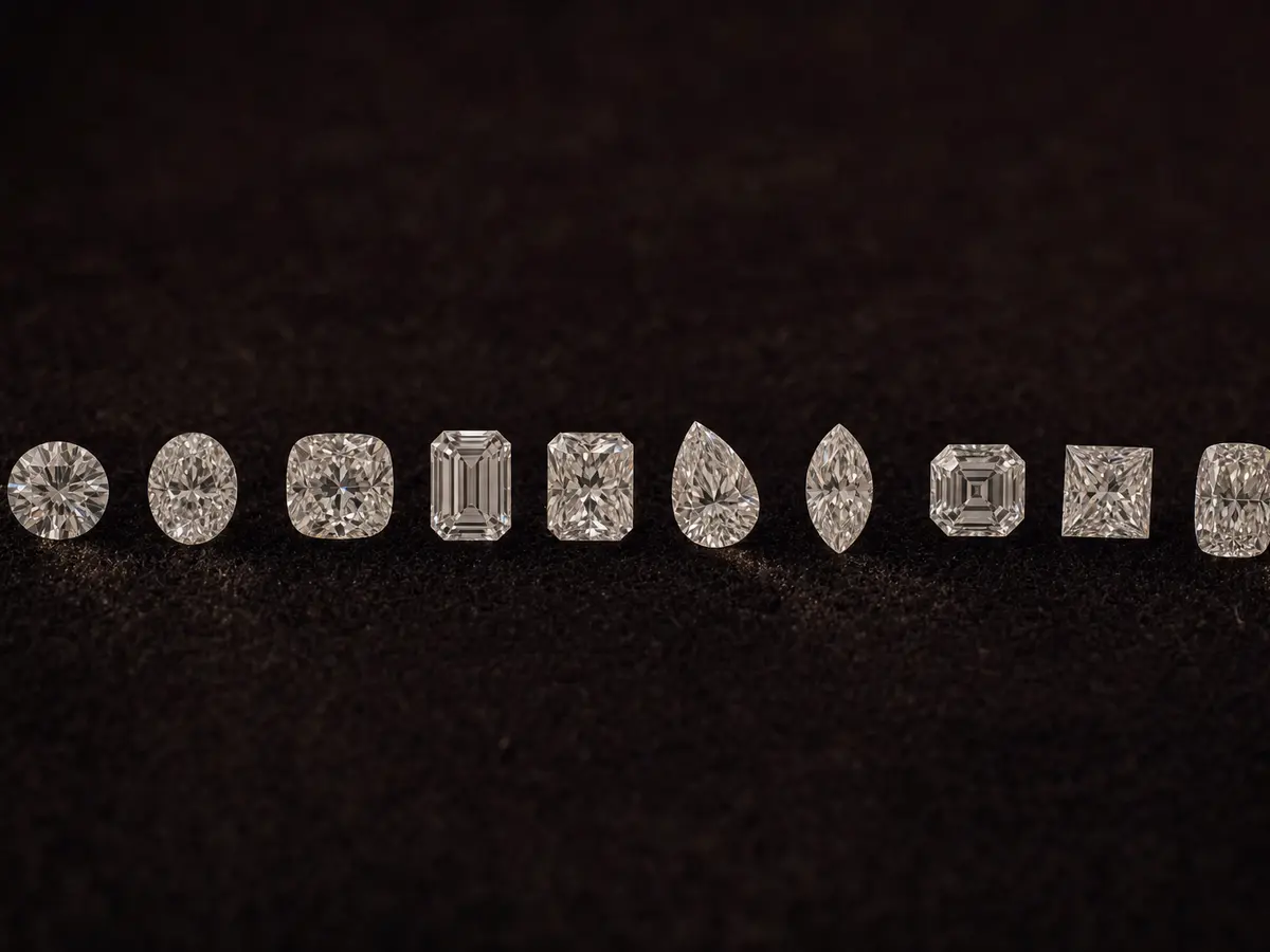
Most major laboratories issue a formal cut grade only for round brilliants, because decades of consistent research have settled what an ideal set of round brilliant proportions looks like, and enough stones exist in that one shape to grade against a stable standard. Fancy shapes such as oval, cushion, pear, emerald and marquise have far more legitimate variation between cutters, no single agreed ideal, and nowhere near the same weight of research behind them. That is not a gap in the report; it is a genuine limit of what a fixed grading system can honestly claim to measure for a shape with no single correct proportion. It is exactly why a fancy shape has to be looked at rather than ordered from a number.
Hearts and arrows, as a concept
Hold a well cut, precisely symmetrical round brilliant pavilion-down over a special viewer and you can sometimes see a pattern of hearts; turn it crown-up and the same precision shows as a pattern of arrows. This is not a grade on any report. It is a demonstration tool that shows how exactly the facets are aligned with one another, and it is one more way of confirming, by eye, what the angles and the symmetry grade are already telling you on paper.
- Crown angle
- Slope above the girdle; too shallow or too steep both lose brilliance.
- Pavilion angle
- Slope below the girdle; the single biggest factor in light leakage.
- Table size
- The flat top facet as a share of the stone's width; too large looks flat.
- Total depth
- Height as a share of width; too deep hides weight where it does not show.
- Girdle thickness
- Too thin chips easily; too thick adds hidden, unflattering weight.
Everything else on a report describes what a stone is. Cut describes what was done with it, and it is the one grade you can actually see change in front of you at the bench.
I have shown clients a G colour, SI1 clarity stone next to a D colour, flawless one and watched them pick the G every time, because it was cut better. That is the whole argument for spending here first.
Can a diamond have excellent proportions and still not look right?
Yes, occasionally. Proportions on paper describe the angles in isolation, and a stone can meet every published range for crown angle, pavilion angle, table and depth and still be let down by uneven polish, a poorly aligned culet, or facets that are individually within range but not well matched to one another. This is rare in a genuinely excellent-graded stone, but it is the reason we still look at every stone in person rather than buying purely from the numbers on a report.
Is it worth paying more for hearts and arrows in a diamond?
It is a legitimate reason to pay a small premium if exceptional symmetry matters to you personally, but it is not a separate grading category and it will not be visible to anyone across a table. What it reliably tells you is that the cutter was working to a very high standard of alignment. If the goal is simply the most beautiful stone on the hand, an excellent cut grade with strong symmetry already gets you almost all of the visible benefit.